
Not a website refresh. A full identity, built from scratch.
Evolt is a senior-heavy software engineering company specialising in fintech — POS systems, neobanking, AI infrastructure, security and DevOps — with a team where over 60% operate at senior level and the leadership carries decades of hands-on engineering experience. They are recognised by Deloitte's CE Technology Fast 50. Their clients include some of the most complex, compliance-heavy companies in European fintech.
They came to us looking like none of that.
Evolt was referred to us by Dejan Roljič, CEO of NAKA — a client we had recently delivered a full website for. Dejan is also an investor in Evolt, and he had been direct with their team: the brand was not representative of the company they had become. The rebrand was his push as much as theirs.
That context mattered. Evolt did not arrive uncertain about whether they needed this work. They arrived knowing they did, with a clear mandate to fix it properly — and they gave us the room to do exactly that.
Our main contact throughout was Juš Dobnikar, Evolt's CBDO. He was decisive, gave clear feedback, and kept the project moving. Working with a client like that makes a measurable difference to what you can achieve.
The old Evolt brand had not aged well. The logo carried a gradient — an immediate visual signal of a different era. The website felt like it had been built on WordPress years ago and never fundamentally reconsidered. The copy tried to speak to every possible client in every possible industry, which meant it spoke compellingly to none of them.
The brand was hiding what the business had already become.
The positioning reflected this. Evolt's existing language described them as a "global technology-agnostic house" — technically accurate, but completely forgettable. In reality, the overwhelming majority of their clients came from fintech. We kept one thing from the old identity: the name.
Identity before everything.
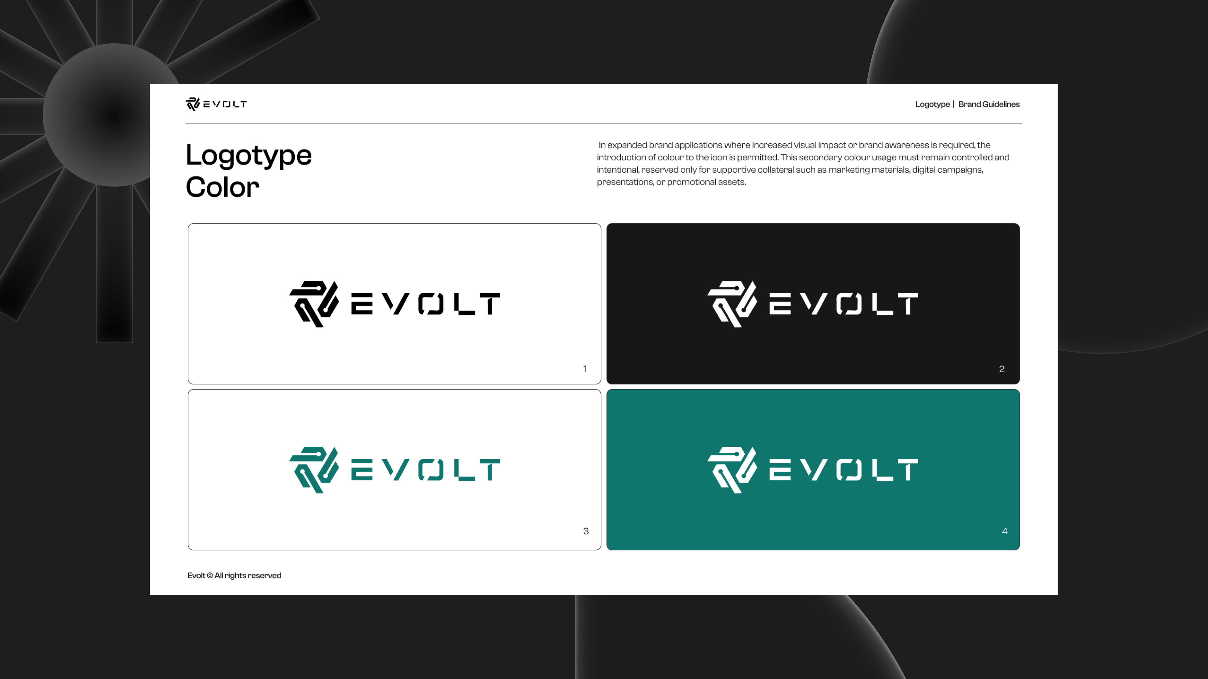
On a project of this scope, there is a temptation to move fast across all fronts at once. We did not. We started with the logo, because everything else — the website, the merch, the copy, the guidelines — flows from it. Getting it wrong at the foundation means carrying that mistake through every subsequent decision.
We presented ten logo concepts. None landed where we needed them to. We regrouped, understood more precisely what was and was not working, and presented ten more in a refined direction. The second round produced a winner. It was a longer process than anyone wanted, but the result held up — and more importantly, it held up as the anchor for everything that came after.
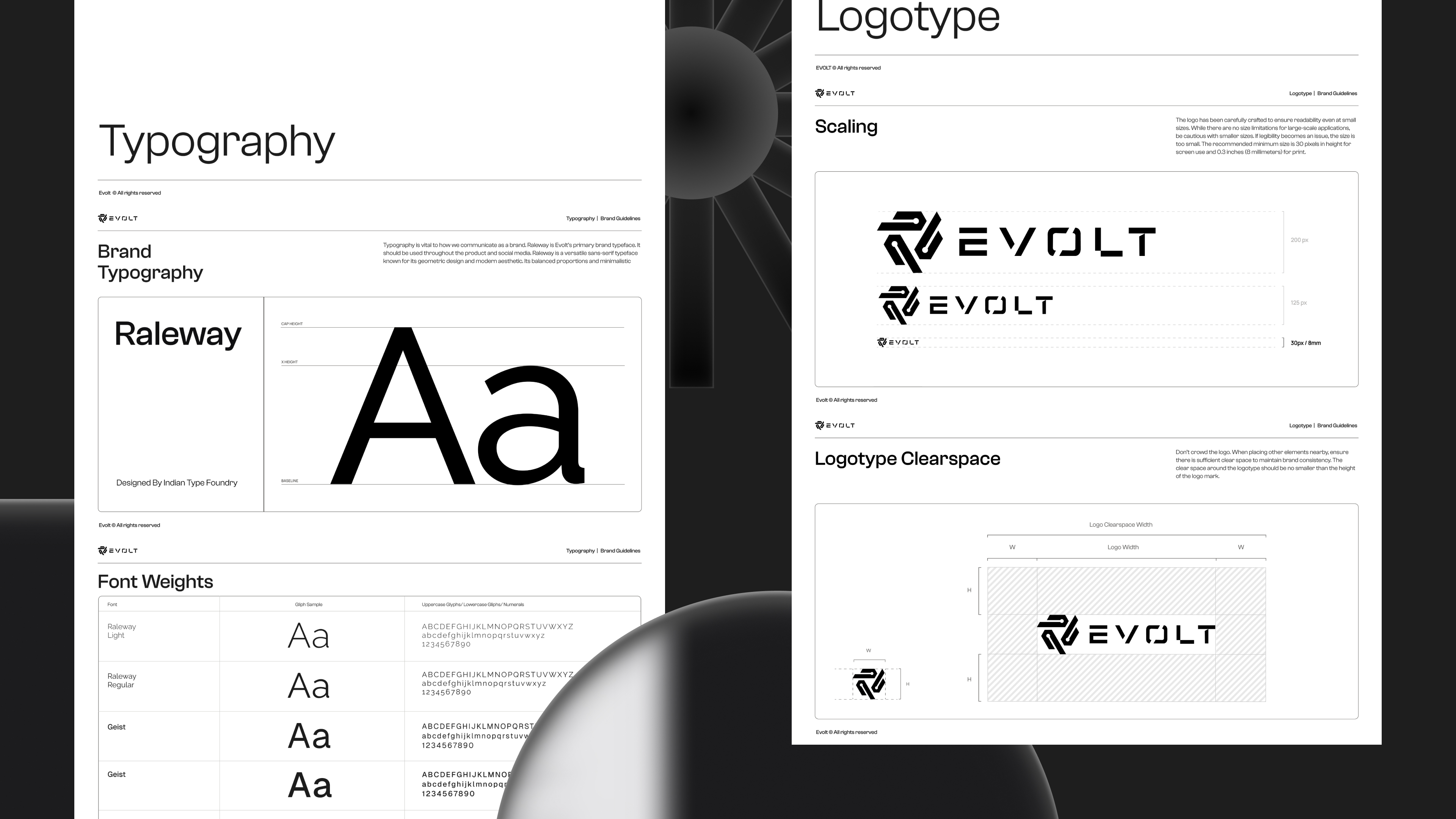
From there we moved to typography and colour, then assembled the full brand guidelines. Only once the identity was locked did we begin writing the website copy.
Copy written from scratch.
Unlike projects where a client arrives with material that needs restructuring, Evolt came with no copy to reuse. We built it from a blank page — starting with the homepage, collecting feedback, implementing it, then moving through every subsequent page in sequence.
The most important decision we made in the copy was one of focus. Evolt had been trying to serve every industry. We pushed them to lean into what was already true: most of their clients are in fintech, their leadership has deep fintech expertise, and their strongest case studies all sit in that space. The headline we landed on — Engineering ownership for high-stake fintech — did not come from a brief. It emerged from the process of writing honestly about what Evolt actually is.
Reference websites, one wireframe, and a clean run through.
Once the copy was in place, we sent Evolt ten reference websites and asked them to grade each from one to ten. The scores gave us a precise read on their visual instincts — not what they said they liked, but what they actually responded to.
We translated that into a single homepage wireframe. They approved it immediately. From there we moved page by page: design, client approval, development. No parallel tracks, no rework loops. The sequential discipline that served us on NAKA served us again here.

Most company merch exists to be worn once at a company retreat and forgotten. We wanted Evolt's to mean something.
Working from the name itself, we developed a values system: E for Execution, V for Value, O for Obsession, L for Learning, T for Trust. Each letter represents a core principle. Each principle gets its own design. Each design lives on a different piece of merch.
The full range covers hoodies, t-shirts, polo shirts, backpacks, caps, mugs, and metal water bottles. The idea is that every Evolt team member tries to collect all five values — one per item. It turns the merchandise into something with internal meaning and a reason to want all of it. The designs themselves pull visual elements directly from the website, so the merch and the digital brand feel like they belong to the same world rather than being produced separately and forced together.
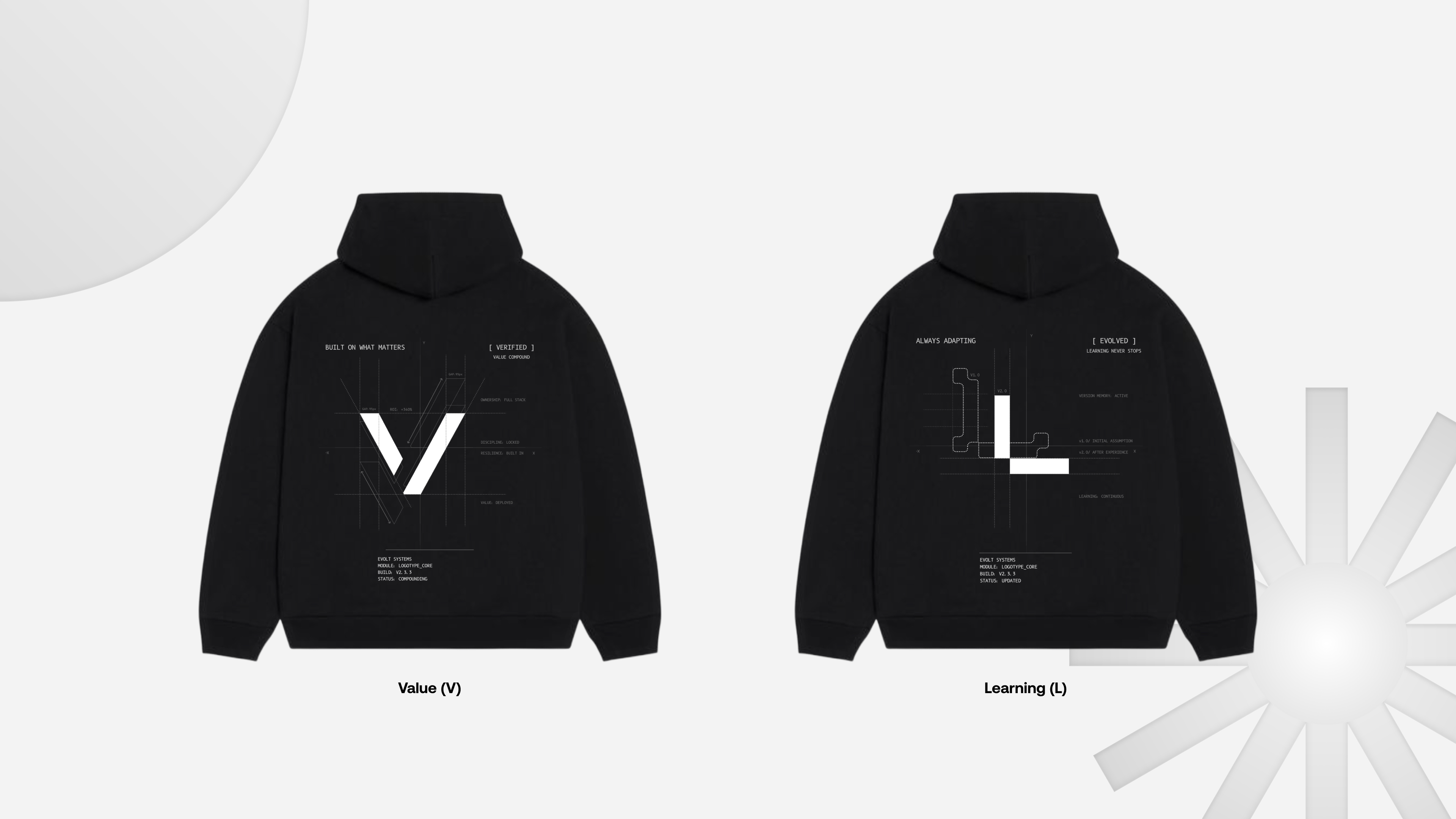
We produced two physical hoodies before the full launch to show the team. They were well received.
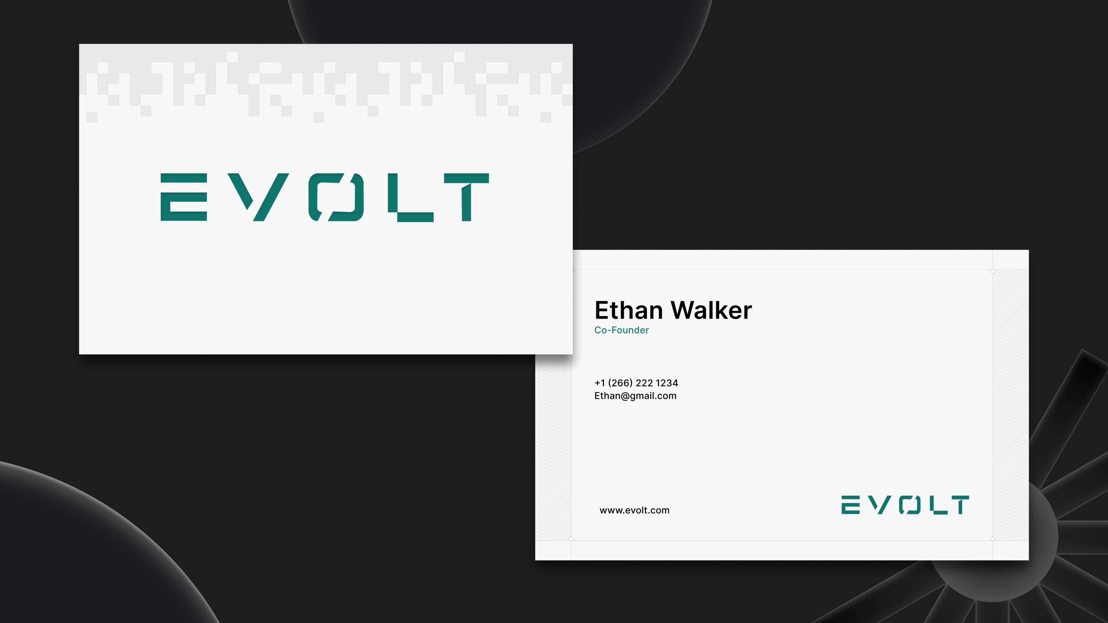
The rest of the brand system followed the same structured approach: three business card concepts presented, one direction chosen with minor refinements. Three email signature concepts presented, one chosen. Ten LinkedIn banner variations for the company page, ten for the employee banner.
Everything — the website, the brand, the merch system, the LinkedIn banners, the business cards — launched together. When Evolt showed the new website to people ahead of the launch, the response was consistent. It was complimented, unprompted, every time.
That reaction is meaningful not because it is flattering, but because of what it signals: the site communicates immediately. People who know nothing about Evolt land on it and understand what they do, who they do it for, and why they are worth taking seriously. That is what a brand is supposed to do, and it is what the old one was not doing.
For Webtic, the Evolt project represents the fullest expression of what we build for a client. Not a website. Not a logo. A coherent identity — one that runs from the homepage to the employee's hoodie and means the same thing in both places.
- Brand Strategy & Positioning
- Logo Design
- Brand Guidelines
- Typography & Colour System
- Website Copy
- UX & Visual Design
- Framer Development
- Merchandise Design
- Business Cards
- Email Signatures
- LinkedIn Banners